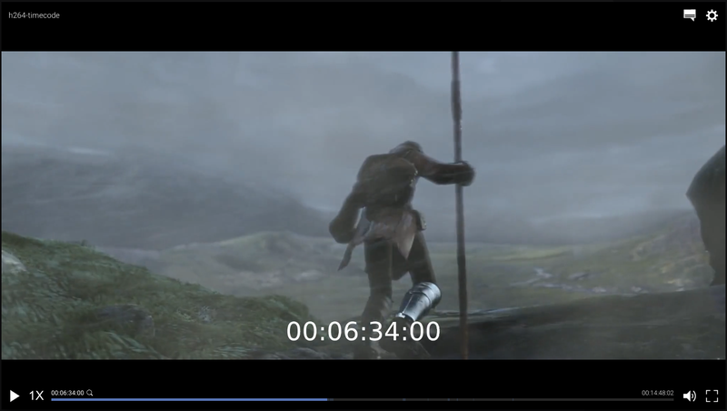
This is another optional package that extends Accurate Player by providing a default, sensible UI layer on top of the player. The UI layer reacts to events in the player and automatically adapts to however you configure the player with regards to implementation and plugins. Of course, you can also customise the UI layer by changing colors and fonts, or create your own UI layer entirely.
<script src="./node_modules/@accurate-player/accurate-player-controls/bundle.js"></script>
...
<style>
 .video-container { position: relative; }
</style>
...
<div class="video-container">
 <video></video>
 <apc-controls></apc-controls>
</div>
Note it's important that the container element for <apc-controls> has position either relative or absolute to achieve the correct layout since it fills its parent absolutely.
To initialise the UI controls, simply provide it with a reference to the video element and the player object, like so:
document.getElementsByTagName("apc-controls")[0].init(
 HTMLVideoElement,
 player
);

There are a number of settings that can be configured when initialising the player. The snippet below shows the default values to the available settings:
const settings = {
 autoHide: true,
 saveLocalSettings: true,
 volume: 1,
 togglePlayOnClick: true,
 labels: {
 subtitlePopup: {
 subtitles: "SUBTITLES",
 discreteAudio: "DISCRETE AUDIO",
 audioSettings: "AUDIO SETTINGS",
 }
 }
};

document.getElementsByTagName("apc-controls")[0].init(
 HTMLVideoElement,
 player,
 settings
);
Note Default values of autoHide and volume will be overridden by the user settings if saveLocalSettings is true. The correct way of overriding the values to always match the default values is to set saveLocalSettings: false.
The UI controls are customisable when it comes to colors via CSS variables. The code below shows our default values and you can easily test this by adding any of these rules to e.g. the <body> element.
--apc-primary-text: #d8d8d8;
--apc-secondary-text: rgba(255, 255, 255, 0.7);
--apc-disabled-text: rgba(255, 255, 255, 0.5);
--apc-icon-color: rgb(255, 255, 255);

--apc-primary: #6280c0;
--apc-primary-hover: #6280c022;

--apc-font-family: 'roboto', sans-serif;
--apc-font-size-base: 100%;